Draft:Soyuzmultfilm: Difference between revisions
| Line 137: | Line 137: | ||
'''Technique:''' Animation of the cartoon man. Still version existed. |
'''Technique:''' Animation of the cartoon man. Still version existed. |
||
'''Music/Sounds:''' |
'''Music/Sounds:''' In the animated variant, when the man pulls out the words, two creaking sounds play. |
||
'''Availability:''' This was a custom logo used by animators Z. and V. Broomberg. |
'''Availability:''' This was a custom logo used by animators Z. and V. Broomberg. |
||
=== 8th Logo (1967) === |
=== 8th Logo (1967) === |
||
Revision as of 23:56, 7 February 2023
Jack Jackie Pomi
Captures by
Jack Jackie Pomi and MizukiAccent48
Background
Soyuzmultfilm (Союзмультфильм; originally Soyuzdetmultfilm (Союздетмультфильм)) is a Russian (formerly Soviet) animation studio, founded on June 10th, 1936 in Moscow from a merger of animation groups of Sovkino, Mezhrabpomfilm, and Mosfilm. In July 1937 the studio was renamed to its current name. Soyuzmultfilm is the largest Soviet animation studio founded in June 1936 and gained its current name in the year after. During the World War II, they were temporarily evacuated out of Moscow. Starting from the 1990s, the studio slowly went into a downfall, and the production facilities were practically destroyed, leaving only the building and the archive of more than 1500 Soviet cartoons. In the late 2000s, the studio began working again with minimal output. They never had a steady logo, using mainly stylized writings of the name. Several animation collectives working inside Soyuzmultfilm created their own trademarks in the 1960s.
1st Logo (1937-1941)


Logo: A pencil appears, drawing the circle, then it draws the words "СОЮЗ МУЛЬТ" (SOYUZ MUL'T) stacked on each other, and stops horizontally while the filmstrip hangs down from it. The word "ФИЛЬМ" (FILM) appears vertically on the filmstrip.
Technique: Simple but good (for those years) animation.
Music/Sounds: None.
Availability: Extremely rare. Can be seen on a pair of oldest pre-war cartoons.
2nd Logo (1940s-1950s)

Logo: The enhanced previous logo zooms in, while a webbed pattern moves in background, then the name wipes itself below.
Technique: The logo zooming and writing. This logo was later remade by Krupny Plan.
Music/Sounds: None.
Availability: Extremely rare.
3rd Logo (1936-1937, 1946-1964)
-

It's hot in Africa (1936)
-

Non-called Guest (1937)
-

Spring Melodies (1946)
-

Old friends (1956)
-

-

-

-

-

-

-

-

-

-


Logo: The standard Soviet announcer is seen, showing the name in Cyrillic (Produced by / the film studio / SOYUZMULTFILM / Moscow [year] ). Different styles and colours can be used.
Technique: None.
Variants:
- There was a rare export English version used once in 1955, but the translation is not literal.
- Starting from 1960, the year of production would not appear anymore.
Music/Sounds: None.
Availability: Was very common from the late 40s to the early 60s and can be found on cartoons from these years. The English variant was used on Snegovik-pochtovik.
4th Logo (1940s- )
-
-

-

The Three from Prostokvashino (1978)
-

The Tale about Tsar Saltan (1984)


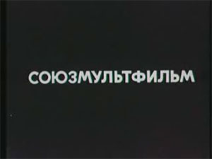
Logo: Just the name in Cyrillic, written in one line.
Technique: None.
Music/Sounds: None.
Availability: The most common logo during Soviet era and the early 90s.
5th Logo (1955-1956)

Logo: TBA.
Technique: The logo writing itself.
Music/Sounds: None.
Availability: Extremely rare.
6th Logo (1960-2000s)


Logo: The name, divided into three parts, appears one after one like this:
СОЮЗ
МУЛЬТ
ФИЛЬМ
Variants: The name can be shifted to upper left corner.
- Sometimes the word "ПОКАЗЫВАЕТ" ("Shows") can be seen below.
- In early years, the year appeared instead.
Technique: None.
Music/Sounds: None or the opening theme.
Availability: Started to appear sometime in 1960 and was common till the early 2000s.
7th Logo (1967-1974)

Logo: On an orange background, the white box (representing a sheet of paper) is seen with the pencil-drawn man (from Fedya Zaycev) inside. The name is written above the box, and "MOSCOW" in Cyrillic below. Also, there's an animated variant of this logo, which starts out with the pencil-drawn man drawing in, then he pulls out the company name from the top and "МОСКВА" from the bottom with a parasol as a hook and strikes a pose when it's done.
Technique: Animation of the cartoon man. Still version existed.
Music/Sounds: In the animated variant, when the man pulls out the words, two creaking sounds play.
Availability: This was a custom logo used by animators Z. and V. Broomberg.
8th Logo (1967)

Logo: There is a drawn man inside a stylized frame, with "SOYUZMULTFILM" and "MOSCOW" wrapping around the picture.
Technique: None.
Music/Sounds: None.
Availability: Used once on the cartoon called Pesenka Myshonka (Song of the Little Mouse).
9th Logo (June 14, 1969-June 24, 1994)


.png)


Logo: The logo has the Cyrillic name in the specially designed cartoonish style and various coloured letters "СОЮЗМУЛЬТФИЛЬМ". In early years, the word "ПОКАЗЫВАЕТ" ("Shows") could be seen below and the colour was uniform, but currently every letter have its own colour.
Variant: On the very first episode of Well, Just You Wait!, a pencil with filmstrip appears below, similar to these from the first logo.
Technique: None.
Music/Sounds: None or the opening theme.
Availability: Uncommon, but not rare. Can be found on episodes 1-18 of the well-known cartoon series Well, Just You Wait! & Nu, pogodi!.
10th Logo (1978)

Logo: We see an MGM-like logo (resembling the 6th logo, without any text). The lion moves very similar to the aforementioned above. A few seconds later, the lion stops roaring, revealing two hands grab the lion's head (as being a mask). The hands move the mask as Cheburashka (the studio's mascot) appearing. He throws the mask and stare to the viewer. The company name doesn't appear.
Technique: The lion moving, Cheburashka moving the mask. It's a parody of the MGM logo.
Music/Sounds: The lion roaring followed by a 6 note fanfare.
Availability: Only seen on Ograblenie Po...
11th Logo (1980?-1992)

Logo: The famous cartoon character Cheburashka is wrapped by the company's name, with a star below.
Technique: None.
Music/Sounds: None.
Availability: Used on The Mystery of the Third Planet, among others. Currently used as a print logo.
12th Logo (1980s)

TBA
13th Logo (1992- late 1990s)

Logo: On a deep blue background, the name is written in three lines, coloured as the Russian flag. The outline of a pencil is seen with two merged white pigeons on its top.
Technique: None.
Music/Sounds: None.
Availability: Very rare. Was seen on a few cartoons and quickly abandoned.