|
</gallery><center><youtube width="240" height="185">ycNPXRNiKFk</youtube></center>
'''LogoVisuals:''' On a {{color|darkblue|dark blue}} background, what appears to be a total eclipse of the sun is seen, "shining" from its edges. The "shining" retracts after a second followed by the shadow beginning to move off the "sun", revealing it to actually be a light blue planet-like object. As the shadow gets halfway off the planet, it opens up like an egg and a bright array of coloured light bursts out. A couple of seconds later, the light retracts back into the planet and the two halves come back together to reveal the planet, which now has a crescent shaped shadow. Finally, the word "CENTRAL" fades in below the planet, set in Erbar Neo Mini.
'''Trivia:''' This logo was designed by Minale Tattersfield, famous for designing Thames' logo.
</gallery><center><youtube width="240" height="185">UV1ooMptQWc</youtube></center>
'''LogoVisuals:''' On a black background, a shining circular outline fades in. A dark shadow slowly dissipates from the right side, revealing itself to be a white spherical object with a rainbow crescent. The word “CENTRAL”, in the same font as before, slowly fades in below the logo.
'''Variants:'''
{{YouTube|id=VW1wquYxll8|id2=YLVxB6jlaYU}}
'''LogoVisuals:''' On a black background, a simplified, 3D, cylindrical version of the symbol from the 2nd logo is seen, divided into twelve blocks. There are six coloured blocks (from above to below: {{color|red}}, {{color|orange}}, {{color|#FFD900|yellow}}, {{color|limegreen|green}}, {{color|deepskyblue|light blue}} and {{color|darkviolet|purple}}) to the left, which form a crescent shape, and six white ones to the right. Under the symbol is the word "'''CENTRAL'''" in the same font as before. There are many variants of the logo, the symbol of which flies around the screen in a similar fashion to Channel 4's 1982 logo package. Note that this logo was only used in the Midlands.
'''Variants:''' Many variants were used during the ident's lifespan. The following list is not exhaustive, and many other variants may exist.
{{YouTube|id=s5GzE-ozRJE|id2=3R1-wllcg1M}}
'''LogoVisuals:''' On a black background, a {{color|silver}} disc (divided into six rows and a crescent-shaped column appearing towards the screen) rotates from underneath, while six small coloured balls ({{color|red}}, {{color|orange}}, {{color|gold|yellow}}, {{color|green|limegreen}}, {{color|blue}} and {{color|darkviolet|purple}}) leap from the bottom of the screen. As we reach the frontal view of the logo, now in white (the crescent part is still {{color|silver}}), one by one the balls quickly fall and absorb into the {{color|silver}} segments on the left. The logo continues to rotate until it reaches the centre of the screen, while the word "'''CENTRAL'''" (in white) fades in underneath. The end result is a segmented white disc with a multi-coloured crescent three quarters towards the left.
'''Variants:''' Different variants apply:
</tabber>
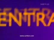
'''LogoVisuals:''' Basically the same animated logos used by Central's then-owners [[Carlton Television|Carlton]], but with the word "'''CARLTON'''" replaced by "'''CENTRAL'''".
'''Variant:''' In late 1998, the URL for "www.centraltv.co.uk" appears on the bottom of the screen in white but was later changed to "www.carlton.com" beginning in mid-July 1999.
| 


_(From_-_27_December_1984_broadcast).png)


 Alarm Clock
 Buildings
 Cinema
 Football
 ITV (pre-October 1998)
 ITV (October 1998-1999)
 Laugh
Laugh Multiple
 News
News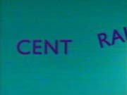 Newton's Cradle
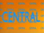 Noise
Noise Party Blower
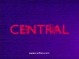 Ripple
 Sheepdog
 Shuffle
 Slots
Slots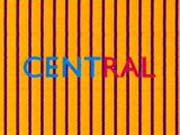 Stripes
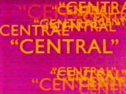 Talking
 Volleyball
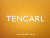 Word Game


